And here is the sketch:
As you see, I cut my patterned papers and used two differents in horisontal strips for the large one going over both sides. That way I didn't have to use two of the same papers. For the banners I used leftovers. I mixed papers from different manufactures.
Over at the Stick it Down blog you will also find the July card and one-page layout sketches.
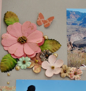
Her are some closeups of my page:
I used Prima flowers for my flower clusters.
This swirl were cut for another project, but I didn't use it and have been laying on my table for a time. Now I got to use it.
I used a die from Spellbinder to cut out corners and used them in the places of the swirls on the sketch. Here together with one of the flowerclusters.
In addition to the journaling I put on two labels with the names of two of the stone formations.
My title says "magnificent" in norwegian.


1 kommentar:
Yes, magnificent it is! Love the embellishments that make the photos shine!
Legg inn en kommentar