Have made a double layout with photos from San Clemente, CA.
Here are some details:
Have used two stencils and gesso on the background. The chipboards are colored with embossingpowder.
The layout i made based on the September double sketch at Stick it Down.
Viser innlegg med etiketten dobbel LO. Vis alle innlegg
torsdag 26. september 2019
tirsdag 23. april 2019
Bryce Canyon
I've made a layout with photos from our visit in Bryce Canyon last year.
We had a lovely walk down to Queen's Garden and to Navajo Trail.
I've used Sketch 4-1-19 from Let's Scrap for this layout.

Here are some closeups:
lørdag 16. februar 2019
Montezuma Castle
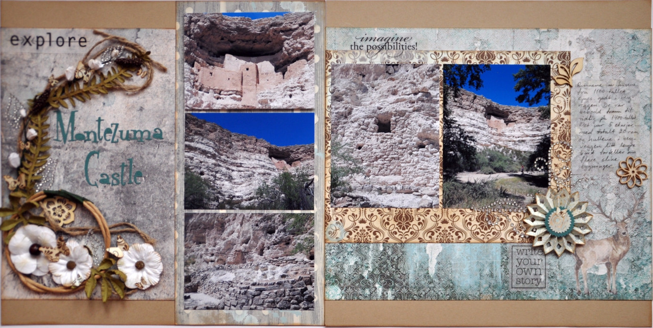
I've made another double layout from our trip last year. This is from Montezuma Castle in Arizona.
For the framing I used a package with flowers and leaves together with some wood veneer, some bling leaves and some punched out butterflies.
I highlighted one photo by putting in up on 3D pads.
I used some sentences on vellum, here is one of them under a diecut made flower and a bling corner.
My journaling is written on some vellum. And I used some more wood veneers to embellish it.
I used the February double side sketch from Stick it Down.

I used an old QK alphabet for the title.
For the framing I used a package with flowers and leaves together with some wood veneer, some bling leaves and some punched out butterflies.
I highlighted one photo by putting in up on 3D pads.
I used some sentences on vellum, here is one of them under a diecut made flower and a bling corner.
My journaling is written on some vellum. And I used some more wood veneers to embellish it.
søndag 27. januar 2019
Observation Point, Zion, Utah
Have made a double page layout with photos from our day hike to Observation Point in Zion, Utah.
We had planned to walk to Angels Landing, but that hike wasn't possible to take due to construction works after damages last summer.
Instead we headed for Observation Point, and ended up with a great view over the valley, after a walk up in the mountain.
As usual, we have a lot of photos from that day, and this month sketch at Stick it Down was perfect.
Some of the embelishments on the tags.
And here a closeup on the right side photos.
We had planned to walk to Angels Landing, but that hike wasn't possible to take due to construction works after damages last summer.
Instead we headed for Observation Point, and ended up with a great view over the valley, after a walk up in the mountain.
As usual, we have a lot of photos from that day, and this month sketch at Stick it Down was perfect.
I used the space on the tags to put on another three photos.

Here are some closeups. First the journaling, about the hike.
Some of the embelishments on the tags.
And here a closeup on the right side photos.
mandag 13. august 2018
Yosemite Valley seen from Glacier Point
Last year we visited Yosemite Valley and started by driving up to Glacier Point and had a marvellous view over the valley.
I've made a layout with some of the photos showing the caracteristic Half Dome. And I used this month sketch from Stick it Down, which I really loved.
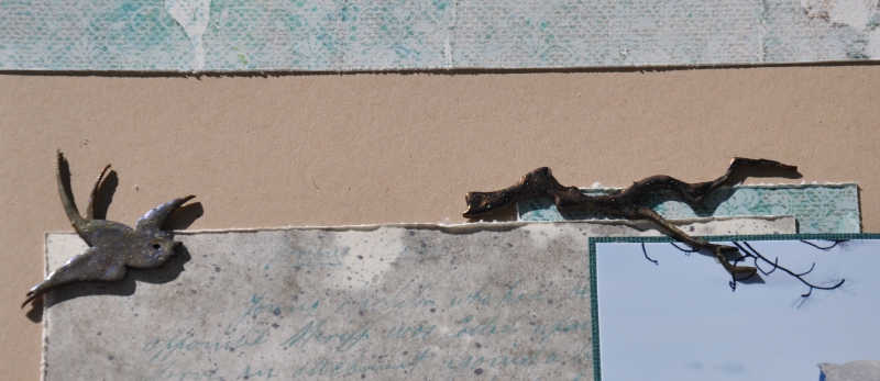
I colored the chipboards with embossing powder from Lindy's Stamp Gang in three different colors.
On the branch I used a darker color than on the birds.
I also put one of the two trees on the right side on 3D-pads so it stands out and give some dimension to the layout.
And also in the summer challenge at Scrapp og skravl.
I've made a layout with some of the photos showing the caracteristic Half Dome. And I used this month sketch from Stick it Down, which I really loved.
Here are some closeups:
I used two different alphabet dies for the title and put the tree on 3D-pads.
I colored the chipboards with embossing powder from Lindy's Stamp Gang in three different colors.
On the branch I used a darker color than on the birds.
I also put one of the two trees on the right side on 3D-pads so it stands out and give some dimension to the layout.
I used a stencil and distress ink to put some birds on the background. And I did put my journaling on both sides, since I had a some left over place on the left side where I had a horisontal photo instead of the vertical on the sketch.
I take part in the challenge at Stick it Down for August Double Sketch.

And also in the summer challenge at Scrapp og skravl.
fredag 26. januar 2018
Morro Bay
I've made a 2-page layout with photos from our vacation in California last November. Here we visited Morro Bay at the coast.
It was windy, but good weather this day.
We walked by the beach and as we came down we saw a lady standing there painting.
I've scatterned some halfpearls around the pages.
I've used the January double page sketch at Stick it Down:
I submit this at Stick it Down just for fun, since I just stepped down from the DT.
It was windy, but good weather this day.
We walked by the beach and as we came down we saw a lady standing there painting.
I've used cardstock with bling, so it shines very nice.
The pattern papers on top are torn and the other are fussy cut.
The pattern papers are from 49 & Market.
I've scatterned some halfpearls around the pages.
I participate in the following challenges:
ARTastic Challenge Blog - January 2018 - Inspiration photo and use vacation photos
Scrappiness: Utfordring 1 - 2018 - Noe gammelt og noe nytt
- har brukt mitt eldste store alfabet, Finale, til overskriften, mens kartong, mønsterark og pynt er nyinnkjøpt
I've used the January double page sketch at Stick it Down:

mandag 4. desember 2017
How to?
Are you making double page layouts?
Are you having trouble presenting them on a blog or instagram?
It isn't just easy to get great photos of double page layouts.
I will share with you how I do it.
Instagram
On Instagram you can now put in a photo that is not a square with all four sides the same.
Open your photo in Instgram an resize it til you can see it all, then you will have a rectangular photo showing off your double page layout.
Are you having trouble presenting them on a blog or instagram?
It isn't just easy to get great photos of double page layouts.
I will share with you how I do it.
I usually
take a photo of my double page layouts with my camera (of course you can use a mobilephone or ipad or so).
To get a good photo of the layout there are a few things to remember:
1. Use a white background.
2. You need good light, daylight is to prefer, but not right in the sun.
3. You got to take the photo as straight as possible, eighter by having the layout on the floor or by hanging it on the wall.
I put the layout on a white cardboard on the floor, somewhere were the light is good. It can look like this. In winter the daylight are very limited here, so I often take my photos with the door open to get the most out of the light (outside is often too cold and some snow):
To get a good photo of the layout there are a few things to remember:
1. Use a white background.
2. You need good light, daylight is to prefer, but not right in the sun.
3. You got to take the photo as straight as possible, eighter by having the layout on the floor or by hanging it on the wall.
I put the layout on a white cardboard on the floor, somewhere were the light is good. It can look like this. In winter the daylight are very limited here, so I often take my photos with the door open to get the most out of the light (outside is often too cold and some snow):
This time I also took photos of one page at a time:
I take the
photo as straight as I can, standing over the layout. This is how my photo of
my layout looked:
I use the
free program PhotoScape, which can be loaded down from here: http://www.photoscape.org/ps/main/index.php.
You can use any program you want to edit the photo in.
In Photoscape you can put two or more photos together, so it is easy to take one photo of each side of your double page and put it together after editing them both.
After I
have edited it looked like this:
And this was the result of the two photos put together:
Here is how
I use it to edit my photo in Photoscape:
1. I open my photo in the Edit modus.
2. I crop the photo, so it’s just the
layout plus some paper around.
3. If necessary I rotate it and
straighten it up.
4. Then I crop it again, so just the
layout shows.
5. It’s time to adjust color and
lightening. I’m no expert, so I just try different thing until I’m satisfied.
6. Resize the photo. I usually rezise
to 1280 x 640 (1280 x 1280 if it’s a single page).
7. Save
How to put
two layout pages side by side in Photoscape:
1. Open the Combine modus
2. Select Horizontal
3. Select photo one and then photo two
(you can change the order up where ou can see the two small photo icons.
4. Save
On Instagram you can now put in a photo that is not a square with all four sides the same.
Open your photo in Instgram an resize it til you can see it all, then you will have a rectangular photo showing off your double page layout.
If you have any questions about this, please ask.
Golden Gate Bridge
It's time for more inspiration on the double page sketch at Stick it Down.
As you can see, I choose to stick pretty close to it. I used only white cardstock and made my own background using gesso, stensils, stamps and mists (Starburst and Moon Shadow sprays from Lindy's Stamp Gang).
I printed one photo in a heart form, and sewed it to the background.
I used two chipboards which I colored with embossingpowder.
I cut up a wood veneer and used the four pieces around the two pages.
For my title I used thickers and tiny alpha stickers.
Here is the other chipboard, and more of the wood veneer.
Another closeup on the background.
This month I have also done a "How to" on taking photos of double page layouts for publishing on blogs and other places. You will find it in my next blogpost.
Here is my take on it:
Here is the sketch:
I printed one photo in a heart form, and sewed it to the background.
I used two chipboards which I colored with embossingpowder.
I cut up a wood veneer and used the four pieces around the two pages.
For my title I used thickers and tiny alpha stickers.
Here is the other chipboard, and more of the wood veneer.
Another closeup on the background.
This month I have also done a "How to" on taking photos of double page layouts for publishing on blogs and other places. You will find it in my next blogpost.
mandag 6. november 2017
LA Chinatown
It's time for more inspiration from the double page team at Stick it Down.
Here is my take on the sketch:
I liked working with this sketch and had a fun time finding all the cut off strips from patterned papers, the ones with the brand and name on one side and a pattern on the other. I always cut these off and save them. They seldom get used, so I have a lot of them.
So fun to get to use them.
I cut them off in different lenght and glued them down on the cardstock.
My photos where a bit larger than on the sketch so I put four on the left side and two on the right side.
For embellish I used micro beads in two different colors on some places on the layout.
Some embellishments in the right down corner.
I used glue to seal the alphatiles and put some micro beads there too.
Here is my take on the sketch:
And here is the sketch:

I liked working with this sketch and had a fun time finding all the cut off strips from patterned papers, the ones with the brand and name on one side and a pattern on the other. I always cut these off and save them. They seldom get used, so I have a lot of them.
So fun to get to use them.
I cut them off in different lenght and glued them down on the cardstock.
My photos where a bit larger than on the sketch so I put four on the left side and two on the right side.
For embellish I used micro beads in two different colors on some places on the layout.
I put a clock and a tab with date down in the left corner.
Down on the strip at the edge I glued three large glass beads, and did the same on the top of the strip on the right side.
Some embellishments in the right down corner.
I used glue to seal the alphatiles and put some micro beads there too.
Abonner på:
Innlegg (Atom)